Standalone UI
UI Widgets
A UI Widget is a standalone asset: a tree of UI elements on a virtual 1920×1080 canvas, plus a HorizonCode graph for its logic. Live widgets exist outside the entity world — they belong to the app, not the scene — so a HUD or menu can survive scene changes and is always drawn on top.
Create one with Create ▸ UI Widget in the Content
Browser and double-click it to open the widget editor with its
two modes: Designer and Graph.
WYSIWYG
The Designer
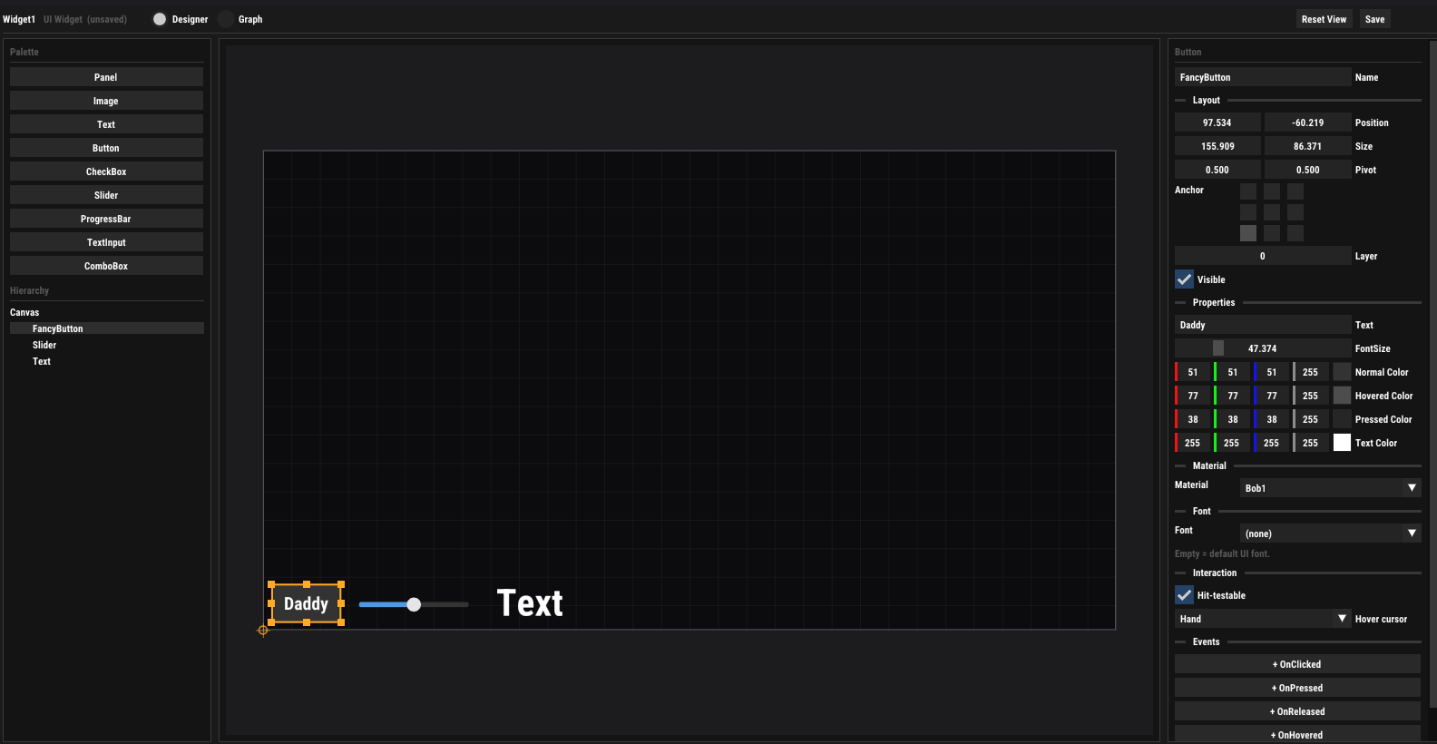
The Designer is a UMG-style layout editor:
- Palette — the nine element types; click or drag onto the canvas. Dropping onto a Panel nests the new element inside it.
- Hierarchy — the element tree; children move with their parents.
- Canvas — WYSIWYG editing with drag-to-move, resize handles, zoom and pan.
- Details — every property of the selected element, plus an Events section: clicking an event (e.g. + OnClicked) jumps to Graph mode and spawns the matching event node.
Layout: anchors & pivots
Every element has a position, size, pivot and a 9-point anchor (top-left … bottom-right). The anchor picks the reference corner inside the parent (root elements anchor to the canvas), the position offsets from it and the pivot shifts the element's own origin — so UIs scale cleanly to any resolution. A layer value orders siblings; visibility cascades down the tree.
Elements can also carry a node-graph material (animated backgrounds, procedural effects — parameters settable at runtime) and a custom font asset, and define their pointer behaviour: hit-testable or click-through, plus a hover cursor (arrow, hand, text, resize …).
Building blocks
Element Reference
| Element | Properties | Events |
|---|---|---|
| Panel | Color; container for nesting | OnMouseEnter, OnMouseLeave, OnClicked |
| Image | Tint (+ material slot) | OnMouseEnter, OnMouseLeave, OnClicked |
| Text | Text, FontSize, Color | — |
| Button | Text, FontSize, Normal/Hovered/Pressed/Text Color | OnClicked, OnPressed, OnReleased, OnHovered, OnUnhovered |
| CheckBox | Checked, Label, FontSize, Box/Check/Text Color | OnCheckChanged (Bool), OnHovered, OnUnhovered |
| Slider | Value, Min, Max, Track/Fill/Handle Color | OnValueChanged (Float) |
| ProgressBar | Value (0–1), Back/Fill Color | — |
| TextInput | Text, Placeholder, FontSize, Back/Text Color | OnTextChanged, OnTextCommitted (String), OnFocused, OnUnfocused |
| ComboBox | Options (list), Selected Index, FontSize, Back/Text/Highlight Color | OnSelectionChanged (Int) |
All elements additionally share the base properties — Visible, Hit Testable, Position, Size, Layer, Hover Cursor, Material, Font — and every property (base and type-specific) is reachable by name from Get/Set Property nodes and from scripts.
Behaviour
Widget Logic (Graph)
Switching the widget editor to Graph mode shows
the widget's HorizonCode graph —
an event graph plus user-defined functions and typed variables.
The host fires Construct when the widget is created,
Destruct when destroyed, Tick (with
delta time) while visible, and one event per element interaction
(OnClicked, OnValueChanged …).
Get/Set Property nodes read and write any element property by
name — update a health bar, swap a label, recolour a button.
Because all graphs share one runtime, a widget can call into the Game Instance, bind events on other classes, and expose public functions that scripts call from outside.
In game
Widgets at Runtime
Widgets are created and managed from any scripting frontend — Lua, Python or HorizonCode:
local M = {}

function M.onStart(self)
    -- spawn the HUD widget and keep its id
    self.hud = horizon.createWidget("UI/HUD")
    horizon.setWidgetZOrder(self.hud, 10)
end

function M.onUpdate(self, dt)
    if horizon.isWidgetVisible(self.hud) then
        horizon.callWidgetFunction(self.hud, "Refresh")
    end
end

return McreateWidget(path)/destroyWidget(id)— instantiate a widget asset, tear it down (fires Construct/Destruct).showWidget/hideWidget/isWidgetVisible— visibility without destroying state.setWidgetZOrder(id, z)— stacking between widgets; widgets always draw above in-world UI.callWidgetFunction(id, name)— invoke a public function of the widget's graph.showCursor()/hideCursor()— release or capture the mouse for menu vs. gameplay; hovering interactive elements shows each element's chosen cursor.
Text input is routed automatically to a focused TextInput element, and pointer events (hover, press, click) drive the elements' visual states and fire their graph events.
In the world
In-World Entity UI
For UI that belongs to the scene — a name tag over a character, a world-space info panel — entities can carry the canvas-based UI components: UI Canvas (screen-space or world-space, virtual resolution), UI Element (anchored rect with pivot, rotation and layer), UI Text, UI Image (material + tint) and UI Button (state colours + an on-click script function).
Scripts address these through the entity UI calls —
setUIText, setUIColor,
setUIVisible, setUIPosition,
setUISize, setUIMaterialParam — and
scripts on the entity receive onClick,
onHoverEnter and onHoverExit.
Which one to use? Menus, HUDs and anything that should survive scene changes → UI Widgets. Labels and panels attached to things in the world → entity UI.